How to Create a Responsive Web Design With Bootstrap
Language
- unknown
by James Smith (Golang Project Structure Admin)
In the current online ecosystem, having a responsive web design is no longer an optional extra — it’s essential.
But designing for lots of different devices and screen sizes can be a challenge. Writing CSS media queries for each screen size, troubleshooting layout issues and ensuring cross-browser compatibility can very easily become time-consuming tasks.
That’s where Bootstrap comes in. It’s a powerful, open-source front-end framework that simplifies the process of building responsive websites.
With Bootstrap, you can create a fully functional, visually appealing, and mobile-first design with minimal effort.
Instead of starting from scratch, developers can take advantage of pre-built components, a flexible grid system and comprehensive documentation to build websites that look great across all devices.
In this introductory guide, we’ll help you to harness Bootstrap’s potential to create a responsive web design with ease, helping you focus more on creativity and functionality while spending less time on repetitive coding tasks.
Table of Contents
Why Should I Use Bootstrap?
Using Bootstrap when working on front-end web design has many advantages, especially if you’re looking for a faster, more responsive and flexible approach to creating modern and sleek websites that will be visually appealing to users.
So listed below are some key reasons why you should seriously consider using Bootstrap:
Responsive Design
Bootstrap’s grid system is one of its main attractions, allowing developers to create layouts that automatically adjust across different screen sizes and devices.
This ensures that your website looks great on mobile, tablet and desktop devices, without the need for separate codebases or designs for each.
Pre-built Components
Bootstrap comes with a rich collection of reusable UI components, such as buttons, forms, modals, dropdowns, navigation bars and carousels. This saves a lot of time, as you don’t need to build these elements from scratch.
Customizable Design
Bootstrap is highly customizable. You can include only the parts you need, such as grid systems or specific components, and customize the styles — such as colours and typography — using Sass or custom CSS to match your particular brand’s look and feel.
Consistent Design
When you’re working with a team or building multiple webpages, Bootstrap ensures a consistent design and similar degree of functionality across your project.
Its components are designed to be uniform, preventing mismatches or style inconsistencies.
Cross-Browser Compatibility
Bootstrap is compatible with all modern browsers, including Chrome, Firefox, Safari, Edge — and even the dreaded old Internet Explorer.
It handles many underlying browser inconsistencies, ensuring that your website works correctly across multiple different platforms.
Faster Development Times
With ready-to-use classes, components and layouts, Bootstrap allows developers to build websites much faster than they otherwise would.
Its predefined styles and JavaScript components reduce the need for custom coding and debugging.
Strong Online Community and Documentation
Bootstrap has a large, active community of developers, which means that it’s easy to find documentation, tutorials and other such resources online.
Whether you’re a junior developer or an experienced coder, you shouldn’t be afraid to seek help and to look for examples of how other people have solved similar problems online.
Integration With JavaScript Plugins
As mentioned above, Bootstrap includes various JavaScript components, like modals, dropdowns and sliders, that are fully integrated with its design framework.
You don’t need to search for additional libraries or write complex JavaScript code to add these interactive elements to your site.
Excellent Accessibility
Bootstrap follows best practices for web accessibility, ensuring that components are built with appropriate ARIA attributes and keyboard navigability.
This helps to make websites more inclusive for users with disabilities and visual impairments.
Mobile-First Approach
Bootstrap adopts a “mobile-first” design philosophy, meaning that its CSS is structured to prioritize mobile devices, then to scale up for larger screens.
This makes it easier to build responsive, mobile-friendly websites right from the start.
Open-Source and Free
Bootstrap is open-source and free to use, which makes it accessible to everyone.
You can download it and modify it, without needing to seek permission. If you want, you can even contribute to its development.
Flexbox-Based Grid System
Recent versions of Bootstrap use flexbox for layouts, which simplifies complex alignment and layout tasks. This results in a more flexible and modern approach to building responsive layouts without dealing with floats or positioning issues.
Which Version of Bootstrap Should I Use?
Bootstrap was first created in 2011 by a small team of designers working at Twitter. It was created to encourage a consistent style across different projects, but it’s now used as a way for back-end web developers to create attractive front-end designs.
At the time of writing this post, there have been five different versions of Bootstrap, the most recent one being released in 2021, a decade after the framework was first launched.
Unless you need a specific feature supported only by one of the earlier versions, you should use Boostrap 5, which is what we’ll be using in the examples that feature in later sections of this post.
Please be aware, however, that this version only supports modern browsers. This is generally not a problem, but if you want your design to work well for people using, for example, Internet Explorer, then you should probably use version 4 or 3.
The most recent versions of Bootstrap have made use of modern CSS layout modules like flexbox, which is also not available in old browsers. Nonetheless, Bootstrap 5 aims to work natively in over 95% of all browsers currently being used, which is a very reasonable target for most projects.
Older versions of Bootstrap also required the jQuery JavaScript library to be included, but that is no longer necessary with newer versions.
Creating a Boilerplate Webpage
To get started with Bootstrap, we will need a basic HTML page to work with.
<!DOCTYPE html>
<html lang="en">
<head>
  <meta charset="UTF-8">
  <meta name="viewport" content="width=device-width, initial-scale=1.0">
  <title>Responsive Example with Bootstrap</title>

  <!-- Bootstrap 5 -->
  <link href="https://cdn.jsdelivr.net/npm/bootstrap@5.3.0-alpha1/dist/css/bootstrap.min.css" rel="stylesheet">
  <script src="https://cdn.jsdelivr.net/npm/bootstrap@5.3.0-alpha1/dist/js/bootstrap.bundle.min.js"></script>
</head>
<body>
  <h1>Welcome to Bootstrap 5</h1>
  <p>This is a simple webpage that will use Bootstrap 5!</p>
</body>
</html>
Above is markup that you can use to produce a basic webpage that loads Bootstrap.
Copy and paste it into a text editor and save the file as bootstrap.html — then load it in your web browser to view it.
Making Our Page Fit the User’s Screen
Consider our inclusion of the viewport meta tag, which is responsible for instructing the browser on how to control the webpage’s dimensions and scaling.
It’s particularly important for responsive design because it ensures that the website will adjusts correctly across different devices, such as smartphones, tablets and desktops.
The width=device-width part of the tag’s content attribute tells the browser to set the width of the page to match the screen width of the user’s device, ensuring that the design always fits the screen size perfectly.
Meanwhile, initial-scale=1.0 ensures that the page is loaded at a 1:1 scale, meaning it isn’t zoomed in or out when the user first opens it. By tweaking these values, developers can control how the layout responds to different screen sizes and user interactions.
Getting the Bootstrap Files From a CDN
We can also see that, in the markup above, we’re loading Bootstrap’s CSS and JavaScript libraries from a CDN (Content Delivery Network).
By using a CDN, you can access the Bootstrap framework without having to download and host the files locally.
This has the added benefit of speeding up page load times, as the CDN delivers optimized and cached versions of Bootstrap files from servers located around the world.
Additionally, using a CDN makes it easier to ensure that your website is up to date with a recent release of Bootstrap, minimizing the chance of compatibility issues or bugs in your code.
Adding Bootstrap’s Grid System
Many people would say that the real power of Bootstrap lies in its grid system.
This grid system uses an underlying 12-column layout, and you can divide these fundamental columns into your own columns, rows and containers to create different page layouts.
So let’s modify our boilerplate to make it responsive with the use of a Bootstrap grid:
<!DOCTYPE html>
<html lang="en">
<head>
  <meta charset="UTF-8">
  <meta name="viewport" content="width=device-width, initial-scale=1.0">
  <title>Responsive Grid Example</title>
  <link href="https://cdn.jsdelivr.net/npm/bootstrap@5.3.0-alpha1/dist/css/bootstrap.min.css" rel="stylesheet">
  <script src="https://cdn.jsdelivr.net/npm/bootstrap@5.3.0-alpha1/dist/js/bootstrap.bundle.min.js"></script>
</head>
<body>
  <div class="container">
    <div class="row">
      <div class="col-md-4 col-sm-12">
        <div class="p-3 bg-primary text-white">Column 1</div>
      </div>
      <div class="col-md-4 col-sm-12">
        <div class="p-3 bg-success text-white">Column 2</div>
      </div>
      <div class="col-md-4 col-sm-12">
        <div class="p-3 bg-warning text-white">Column 3</div>
      </div>
    </div>
  </div>
</body>
</html>
The .container class centers our content and adds padding to the sides. It’s the backbone of the layout.
The .row class groups columns together and ensures they stack correctly.
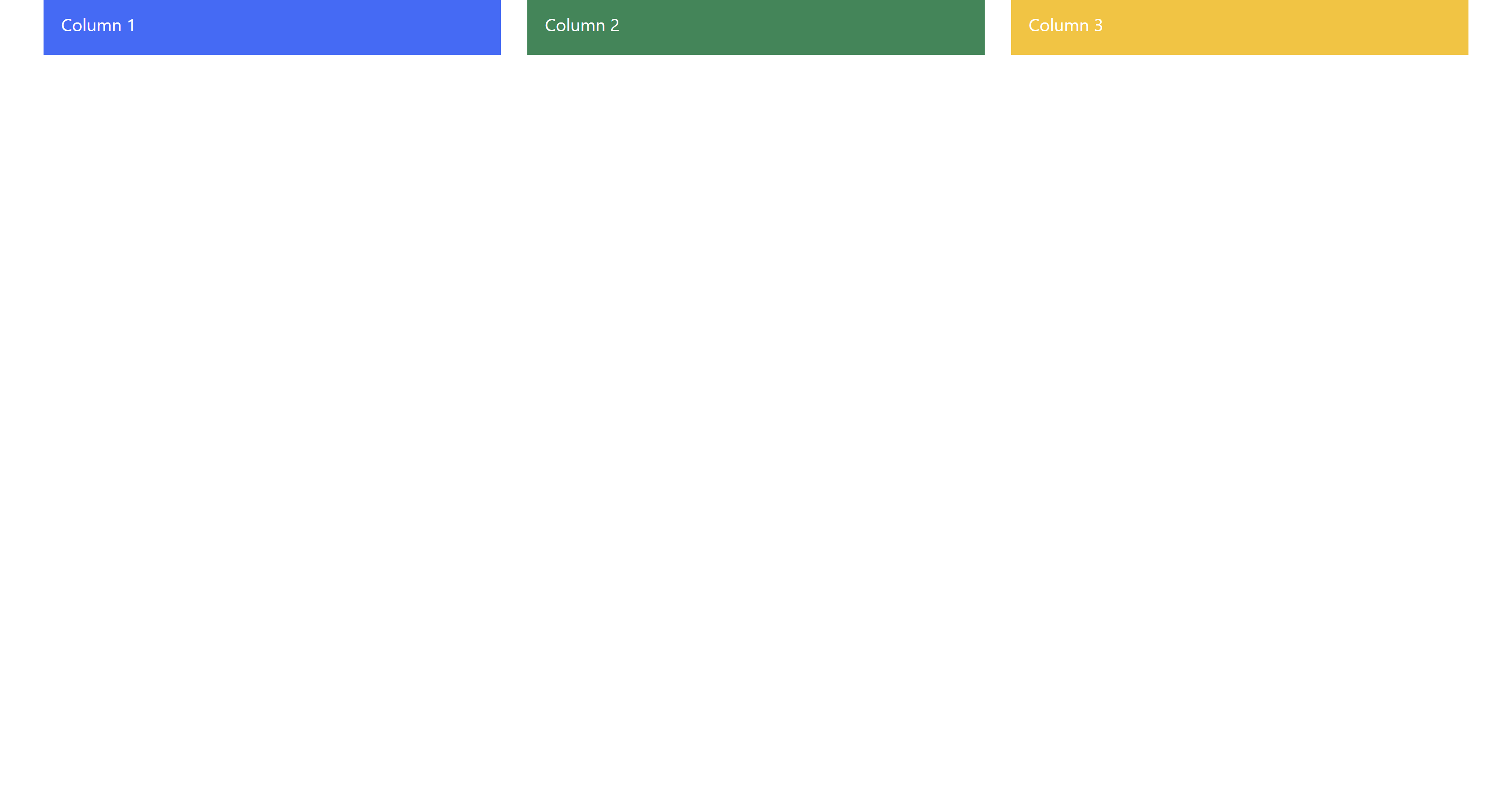
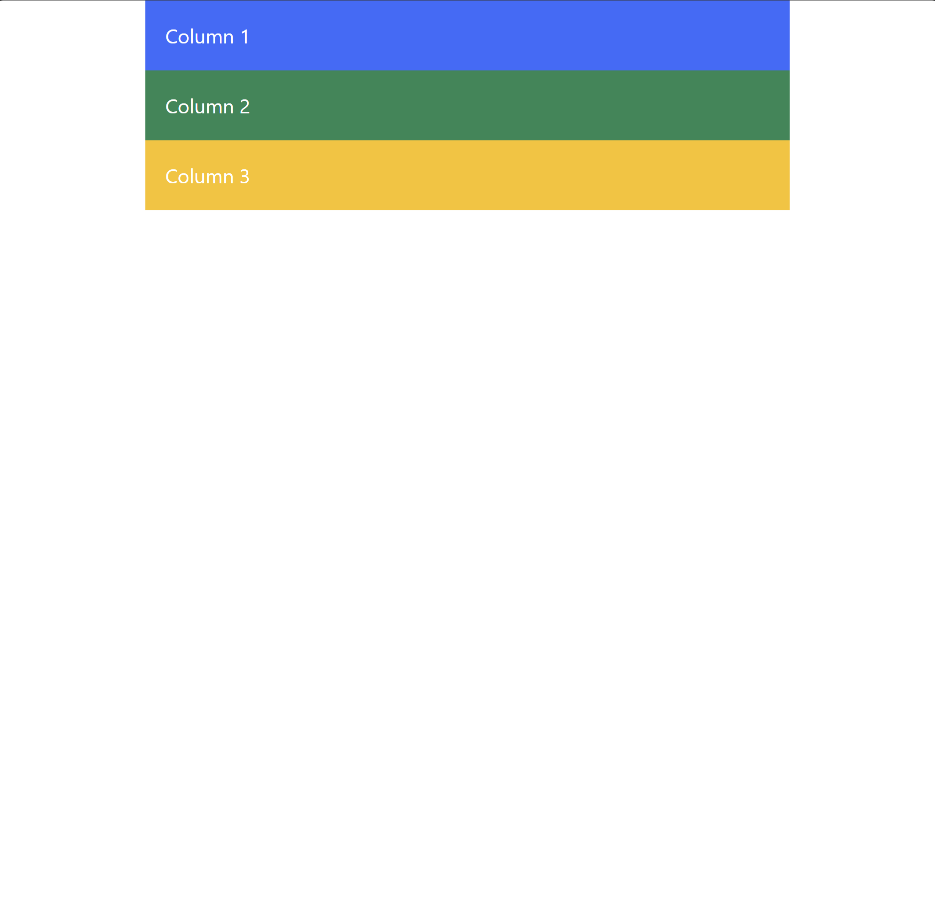
In the example above, we use col-md-4 and col-sm-12. This means that on medium and larger screens (≥768px), each column will take up 4 out of 12 columns. However, on small screens (<768px), the columns will stack vertically, each taking up the full width (12 out of 12).
Looking at Our Webpage
Try opening the webpage in a browser with different window sizes, so you can see how the layout changes responsively, depending on how much room there is.
Now look at how the layout responsively changes when we make the window smaller:
Making the Layout Interactive
As we discussed in the section above, Bootstrap also provides a wide array of JavaScript components — such as modals, carousels and tooltips — that are both responsive and very easy to implement.
So let’s add a simple responsive navigation bar to our webpage.
Place the following markup just after the opening body tag:
<nav class="navbar navbar-expand-lg navbar-light bg-light">
  <div class="container-fluid">
    <a class="navbar-brand" href="#">Navbar</a>
    <button class="navbar-toggler" type="button" data-bs-toggle="collapse" data-bs-target="#navbarNav" aria-controls="navbarNav" aria-expanded="false" aria-label="Toggle navigation">
      <span class="navbar-toggler-icon"></span>
    </button>
    <div class="collapse navbar-collapse" id="navbarNav">
      <ul class="navbar-nav">
        <li class="nav-item">
          <a class="nav-link active" aria-current="page" href="#">Home</a>
        </li>
        <li class="nav-item">
          <a class="nav-link" href="#">Features</a>
        </li>
        <li class="nav-item">
          <a class="nav-link" href="#">Pricing</a>
        </li>
      </ul>
    </div>
  </div>
</nav>
This code creates a responsive navigation bar that collapses into a “hamburger” menu on smaller screens.
The navbar-toggler button allows users to expand or collapse the menu on mobile devices.
Looking at Our Updated Webpage
In the image below, you can see the navbar displayed across the top of the page:
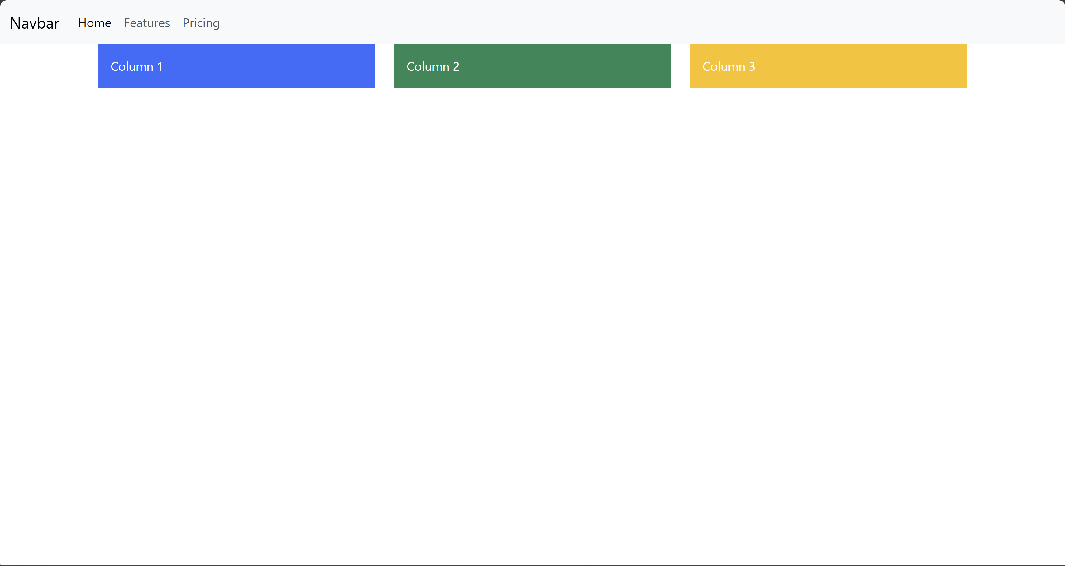
If you try clicking any of the navigation items in the navbar, they won’t take you to another page, because we haven’t actually set up the links.
We’re just focused on creating the design, not on making the page fully functional.
But setting up the links is a trivial task, so I’ll leave that to you.
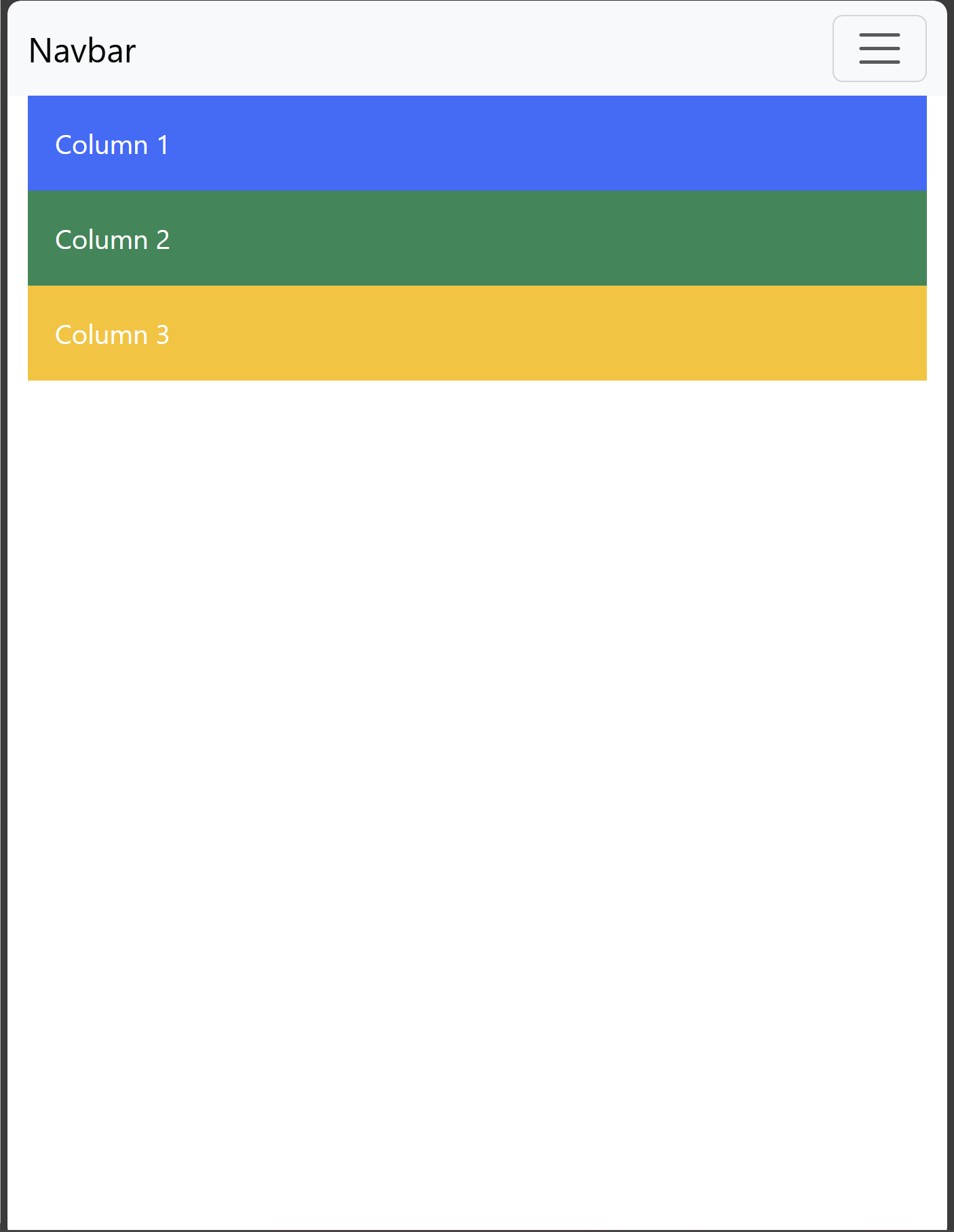
And here is how the page looks on smaller screens or in smaller windows:
Final Thoughts About Using Bootstrap to Create Responsive Webpages
I hope you can now see that creating a responsive web design no longer has to be the overwhelming task it once was. With Bootstrap, you can effectively and efficiently build a modern, mobile-friendly website with ease.
With the examples that we’ve looked at, you should now have learned how to set up a basic Bootstrap page, implement its responsive grid system, and even add interactive components like a navbar.
Whether you’re building a small personal site or a large-scale web application, Bootstrap’s flexibility and ease of use allow you to focus on what matters most — your website’s content and user experience.
Now it’s your turn to put these techniques into practice. Have a look at the documentation, start experimenting with Bootstrap’s various features, build and customize a design to fit your brand’s style, and take some time to explore the wide range of creative opportunities that this framework offers.
The more you dive into it, the more you’ll appreciate the elegant power of the Bootstrap framework and how it can really simplify the process of web design.